• úvod
  • témata
  • události
  • tržiště
  • diskuze
  • nástěnka
  • přihlásit
    registrace
    ztracené heslo?
    SCHWITAUmění hudebního obalu
    SCHWITA
    SCHWITA --- ---
    Photobucket

    Arcade Fire - Neon Bible (2007)

    The artwork for the album is a photograph of a six-foot neon sign that the band commissioned for use while on tour. In the photograph used for the cover, the lighted Bible is caught in mid-flicker. Rolling Stone named the artwork one of the five best of the year. AOL Music cited the cover as an example of an artist "keeping artwork alive." The artwork would go on to win Tracy Maurice and François Miron the Juno Award for best CD/DVD Artwork Design of the Year. Frontman Win Butler stated in an interview that the album title is derived from him being particularly attracted to the image, not from the John Kennedy Toole novel The Neon Bible.
    SCHWITA
    SCHWITA --- ---
    Photobucket

    Yeah Yeah Yeahs - It's Blitz! (2009)

    This striking piece of action photography heralds the third studio release from New York based post-punk act Yeah Yeah Yeahs. Lead singer Karen O’s distinctive vocals are still the band’s signature and this cover art succeeds in capturing the tensions that make her so electric. As sexy as she as she is scary, you want to get her into bed even though you know she’ll eat you’ll alive.

    Apart from the sheer beauty of the photography, this cover appears destined for iconic status because it conveys so much with so little. The aggressive fury in the fist plays in stark contrast to the sensuous colours and textures of the egg.
    SCHWITA
    SCHWITA --- ---
    Photobucket

    Minor Threat - Minor Threat (1981)

    Minor Threat are credited with being one of the first hardcore punk rock groups to come out of the USA. It is true that amongst the punk-underground-alternative-independent-etc scene this album cover, a photo of Alec MacKaye (Ian’s brother) asleep after a gig taken by Susie Josephson Horgan, has taken on an almost iconic status.

    The strength in the sharpness of the colour and the descending print on the right-hand-side is confronting and satisfying. The bald head, the boots, the second-hand clothes and the garbage on the cement floor leave one in little doubt that, if the scene is not desperate, it is one that reflects a subculture of some sort. The band and the label themselves recognised the power of the image by using it three times in different colors.
    SCHWITA
    SCHWITA --- ---
    Photobucket

    Roots Manuva - Slime & Reason (2008)

    “The building of the head was a long process, and one that we weren’t quite sure how to approach. We thought originally that we would commission a sculptor to make the bust, but that was extremely expensive and the result may not have looked exactly like Roots, then we thought about a live cast of the head in plaster, but they can often look quite ‘dead’, the face can sag in the plaster and there isn’t much flexibility with the expression.

    So after some looking around we found out about 3D scanning and rapid prototyping. This was the best option, the scanning process is very quick and accurate, and having the 3D model in the computer meant we could edit the bowl into the head at that stage, before the rapid prototyping. The green slime was 3x bottles of green Aloe Vera hand soap.” (Design Studio: Oscar & Ewan)
    SCHWITA
    SCHWITA --- ---
    Photobucket

    Supertramp - Breakfast in America (1979)

    The album's front cover resembles an overlook of New York City through an aeroplane window. It was designed by Mike Doud and depicted Kate Murtagh, dressed as a waitress named "Libby" from a diner, as a Statue of Liberty figure holding up a glass of orange juice on a small plate in one hand (in place of the torch on the Statue), and a foldable restaurant menu in the other hand, on which "Breakfast In America" is written. The background featured a city made from a cornflake box, ashtray, cutlery (for the wharfs), eggboxes, vinegar, ketchup and mustard bottles, all spraypainted white. The twin World Trade Center towers appear as two stacks of boxes and the plate of breakfast represents Battery Park, the departure point for the Staten Island Ferry.
    SCHWITA
    SCHWITA --- ---
    Photobucket

    Blur - Modern Life Is Rubbish (1993)

    The album's title derives from stenciled graffiti painted along Bayswater Road in London, created by an anarchist group. For Albarn, the phrase reflected the "rubbish" of the past that accumulated over time, stifling creativity. Albarn told journalist John Harris in 1993 that he thought the phrase was "the most significant comment on popular culture since 'Anarchy in the UK'". Due to Blur's disdain for America at the time, the album's working title was "Britain versus America".

    The painting of the steam train on the album cover was a stock image that Stylorouge—Blur's design consultants—obtained from a photo library in Halifax. Inside the packaging, there is an oil-on-canvas of the band dressed as mop-top skinheads in a tube train. The album's lyric sheets also feature the songs' chord progressions, hand-written by guitar player Graham Coxon.
    SCHWITA
    SCHWITA --- ---
    Photobucket

    Burial - Burial (2006)

    Burial’s tunes are ghostly, foggy, late night South London dance music. The beats are hazy and buried underneath layers of rain and pirate radio crackle, the melodies mournful yet hopeful, and vocal fragments echo into the distance. This is music for listening to at night, on a night bus or late walk home on the street.
    The shot of foggy, late night South London not only evokes that feeling you’ll get when hearing the music, but the far-away distance of the shot itself hints at the distant melodies and vocal fragments contained within. Even the text has a foggy glow, like a street light glowing in the rainy night.
    LOPIK
    LOPIK --- ---
    New Order - Blue Monday 12''


    The artwork is designed to resemble a floppy disk. The sleeve does not display either the group name nor song title in plain English anywhere; the only text on the sleeve is “FAC SEVENTY THREE” on the spine. Instead the legend “FAC 73 BLUE MONDAY AND THE BEACH NEW ORDER” is represented in code by a series of coloured blocks. The key enabling this to be deciphered was printed on the back sleeve of the album, Power, Corruption & Lies. “Blue Monday” and Power, Corruption & Lies are two of four Factory releases from this time period to employ the colour code, the others being "Confusion" by New Order and From the Hip by Section 25.
    The single’s original sleeve, created by Factory designer Peter Saville and Brett Wickens, was die-cut with a silver inner sleeve. It cost so much to produce that Factory Records actually lost money on each copy sold. Matthew Robertson’s Factory Records: The Complete Graphic Album notes that “[d]ue to the use of die-cutting and specified colours, the production cost of this sleeve was so high that the single sold at a loss.” Tony Wilson noted that it lost 5p per sleeve “due to our strange accounting system”; Saville noted that nobody expected “Blue Monday" to be a commercially successful record at all, so nobody expected the cost to be an issue. In fact, in Shadowplayers: The Rise and Fall of Factory Records, Saville states “I am so bored with this story. We didn’t even know how many of these expensive covers were ever made anyway.”
    Robertson also noted that “[l]ater reissues had subtle changes to limit the cost” (the diecut areas being replaced with printed silver ink)


    Deska je možná nejvíc prodávanej maxisingl vůbec - o to víc je zajímavý, že jí prodávali za míň než vyrobili..
    SCHWITA
    SCHWITA --- ---
    vkládejte, prosím, přebaly desek ve vhodné velikosti pro všechny typy monitorů. chodí mi do pošty zbytečné připomínky. tapety a plakáty NE!
    věřím, že komukoliv se ten či onen přebal zalíbí, stáhne si ho v rozlišení a velikosti dle svého gusta.
    SCHWITA
    SCHWITA --- ---
    Photobucket

    The Stone Roses - The Stone Roses (1989)

    As with most Stone Roses releases, the cover displays a work by John Squire. It is a Jackson Pollock-influenced piece titled “Bye Bye Badman”, which makes reference to the May 1968 riots in Paris.

    Squire said: “Ian Brown had met this French man when he was hitching around Europe, this bloke had been in the riots, and he told Ian how lemons had been used as an antidote to tear gas. Then there was the documentary – a great shot at the start of a guy throwing stones at the police. I really liked his attitude.” This story was also the inspiration for the lyrics to the song of the same name.
    SCHWITA
    SCHWITA --- ---
    Photobucket

    Arctic Monkeys - Whatever People Say I Am, That's What I'm Not (2006)

    Cover artwork of the album is a photo of Chris McClure — a friend of the band, frontman of The Violet May and brother of Jon McClure of Reverend and the Makers — taken in the early hours of the morning in Korova bar, Liverpool, after the band had given him, his cousin and his best friend "seventy quid to spend on a night out".

    The image caused some controversy when the head of Scotland's NHS criticised the cover for "reinforcing the idea that smoking is okay".[19] The band's product manager denied the accusation, and in fact suggested the opposite: "You can see from the image smoking is not doing him the world of good." In March 2006, McClure announced that he would be giving up smoking, due to lack of funds, though it has been recently reported that his attempts to do so have failed. Billboard advertisements for the album used a similar image to the cover picture, but without the cigarette.
    ASYD
    ASYD --- ---


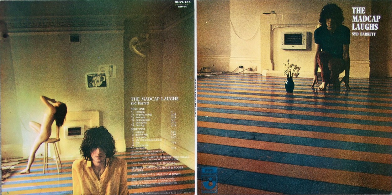
    Syd Barret - The Madcap Laughs (1969)

    For the album cover, Barrett painted the floor of his bedroom in Wetherby Mansions orange and purple.
    The nude woman appearing on the back of the record sleeve was an acquaintance of his known as "Iggy the Eskimo".
    Photographer Mick Rock says, "When I arrived for 'The Madcap Laughs' photo session, Syd was still in his underpants .. His lady friend of two weeks, 'Iggy the Eskimo', was naked in the kitchen .."Iggy met Barrett in the summer of 1966, through Barrett's then-girlfriend, Jenny Spires. A year after Barrett had moved into Wetherby Mansions, Iggy moved in after Spires suggested. Iggy didn't know who Barrett was, that he was previously was in Pink Floyd. Barrett had played to Iggy several songs that would later appear on the album, one being "Terrapin", which she called "quite catchy".
    In October 2010 she was interviewed, revealing that her name was Evelyn.
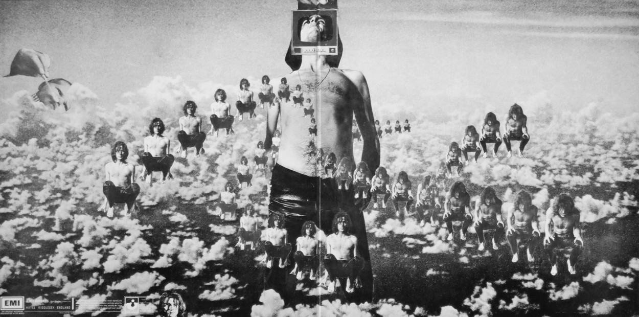
    The album was designed by Storm Thorgerson and Aubrey Powell of Hipgnosis.
    ASYD
    ASYD --- ---


    Pink Floyd - Saucerful of Secrets (1968)

    The first Pink Floyd album to feature cover art by Hipgnosis. The cover art uses Dr. Strange (of Marvel Comics fame), astrology and infrared photography to symbolizes altered states of consciousness. The band is shown on the cover as well.

    Jinak zde stranky o Hipgnosis...coz je firma ktera se specializuje na navrhy obalu hudebnich nosicu...a ze maj ale kousky ;)

    Hipgnosis
    http://www.hipgnosiscovers.com/home.html
    ASYD
    ASYD --- ---


    Red Hot Chili Peppers - Blood Sugar Sex Magik (1991)

    All photography, paintings and art direction for Blood Sugar Sex Magik were credited to filmmaker Gus Van Sant.
    The cover of the album features the four band members' faces positioned around a rose. The lyrics are printed in white lettering across a black background, hand written by Kiedis.
    The booklet also contains a collage of photos assembled to showcase the band members' various tattoos, which feature faces of Native American tribal leaders, animals and sea creatures, as well as various symbols and phrases. Photographs of each band member alone, and two photographs of the band as a whole are also included.

    SCHWITA
    SCHWITA --- ---
    Photobucket

    DJ Shadow - Endtroducing..... (1996)

    The album's front cover depicts Solesides members Chief Xcel (left) and Lyrics Born (right) in Records, a record store at 710 K Street in Sacramento, California. The K Street location of Records closed in December 2006, and has since relocated to the former Tower Video location at the corner of Broadway and South Land Park Drive. The back cover features Beni B (owner of ABB records) and a blind cat belonging to the shop owner.

    Photobucket
    SCHWITA
    SCHWITA --- ---
    Photobucket

    Beck - Odelay (1996)

    The title is a phonetic English rendering of the Mexican slang interjection "órale," which translates roughly to "listen up" or "what's up?" The phrase "odelay" is repeated in the lyrics during the outro of the song "Lord Only Knows". However, according to Stephen Malkmus, the title is actually a play of words on Oh Delay, since the album took very long to record.
    The album's unusual cover is a real photo of a Komondor, a rare Hungarian breed of dog with thick matted hair. The image was chosen at the last minute after Beck failed to decide on an album cover. The image was presented to him by his girlfriend and was chosen almost out of desperation. The typeface was chosen by a record company worker.
    SCHWITA
    SCHWITA --- ---
    ASYD: poctivá internetová rešerše, lepení střepů dohromady. občas se někde objeví výroční žebříček, někdy je zmínka na wiki nebo webu kapely ...
    ASYD
    ASYD --- ---
    prosim prosim pokud je to mozne, davejte k obalum i info jak to dela Schwita...prijde mi to mnohem zajimavejsi

    apropo - kde to vlastne majitel diskuse bere? ja se snazil najit nejaky web anebo format google dotazu ktery by mi pro danou desku tohle info nasel, ale neuspel jsem
    TAJAK
    TAJAK --- ---


    Fatboy Slim ‎– You've Come A Long Way, Baby (1998)

    TAJAK
    TAJAK --- ---


    AIR ‎– The Virgin Suicides (1999)

    Kliknutím sem můžete změnit nastavení reklam