• úvod
  • témata
  • události
  • tržiště
  • diskuze
  • nástěnka
  • přihlásit
    registrace
    ztracené heslo?
    SCHWITAUmění hudebního obalu
    SCHWITA
    SCHWITA --- ---
    Photobucket

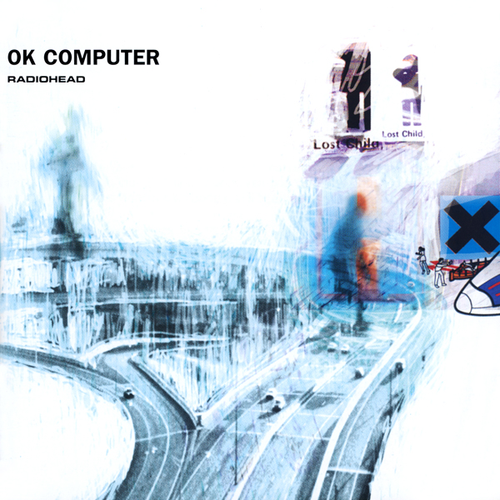
    Radiohead - OK Computer (1997)

    The album's artwork is a collage of images and text created by Stanley Donwood and Yorke, credited under the pseudonym "The White Chocolate Farm". Donwood was commissioned by Yorke to work on a visual diary alongside the recording sessions. Yorke explained, "If I'm shown some kind of visual representation of the music, only then do I feel confident. Up until that point, I'm a bit of a whirlwind." The colour palette is predominantly white and blue, according to Donwood, the result of "trying to make something the color of bleached bone." Used twice on the artwork, once in the booklet and once on the compact disc itself, is the image of two stick figures shaking hands. Yorke explained the image as emblematic of exploitation, saying, "Someone's being sold something they don't really want, and someone's being friendly because they're trying to sell something. That's what it means to me." Explaining the artwork's themes, Yorke said, "It's quite sad, and quite funny as well. All the artwork and so on ... It was all the things that I hadn't said in the songs."
    SCHWITA
    SCHWITA --- ---
    Photobucket

    Primal Scream - Screamadelica (1991)

    The album cover for Screamadelica was painted by Creation Records' in-house artist Paul Cannell, who died in 2005. Screamadelica was among ten album covers chosen by the Royal Mail for a set of "Classic Album Cover" postage stamps issued in January 2010.
    TAJAK
    TAJAK --- ---


    WWW - Neurobeat (2006)
    SPYYDY
    SPYYDY --- ---

    The Residents - Eskimo (1979)

    THE RESIDENTS Eskimo (1979 US 6-track vinyl LP inspired by the sounds recorded and photographs taken by the Residents friend, the mysterious N. Senada while he was in the North Pole, gatefold picture sleeve & original inner. The sleeve shows minor signs of general shelfwear, but the vinyl is flawless! ESK7906).
    SCHWITA
    SCHWITA --- ---
    Photobucket

    The Prodigy . Music For The Jilted Generation (1994)

    The album is largely a response to the corruption of the rave scene in Britain by its mainstream status as well as Great Britain's Criminal Justice and Public Order Act 1994, which criminalised raves and parts of rave culture. The cover of the inner artwork of the record was analyzed in an article published in 2008 in the techno underground Magazine Datacide. The author compares the picture with a persiflage which was published in 2003 on the Kid606 album Kill Sound Before Sound Kills You. The article not only describes the representation of raves in graphic artwork but also describes the marketing strategy of the band with the album and criticizes it:

    "With the picture The Prodigy are taking a stance in the conflict of ravers versus the police in those days. At the same time this statement is used to market a rebellious attitude. The picture is part of the artwork of a record - which is of course a commodity. The teenage (and male) consumer ought to identify himself with the presented rebellion. With the help of the artwork a certain image of The Prodigy is established: They should be seen as anti-stars, who define themselves through refusal and opposition [...]."
    SCHWITA
    SCHWITA --- ---
    Photobucket

    The Misfits - Horror Business (1979)

    The single's cover features a skeletal figure inspired by a poster for the 1946 film serial The Crimson Ghost. The figure became a mascot for the band, and its skull image would serve as the Misfits' logo for the rest of their career.
    SCHWITA
    SCHWITA --- ---
    Photobucket

    The Who - Who's Next (1971)

    Cover artwork shows a photograph, taken at Easington Colliery, of the band apparently having just urinated on a large concrete piling protruding from a slag heap. According to photographer Ethan Russell, most of the members were unable to urinate, so rainwater was tipped from an empty film canister to achieve the desired effect. The striking, partially cloudy sky seen above the site was also composited from a separate image. The photograph is often seen to be a reference to the monolith discovered on the moon in the film 2001: A Space Odyssey, which had been released only about three years earlier.
    SCHWITA
    SCHWITA --- ---
    Photobucket

    The Smiths - The Smiths (1984)

    The sleeve cover for The Smiths was designed by Morrissey. It features American actor Joe Dallesandro in a cropped still from Andy Warhol's 1968 film Flesh. The photograph of Morrissey on the original card inner sleeve was taken at an early London concert by Romi Mori who would subsequently play bass guitar for the Gun Club.
    MADAM_BERNAU
    MADAM_BERNAU --- ---


    FORMA / EAROTIKON (CZ) 2011
    FORMA
    http://forma.bandcamp.com/

    Cover design by Ondřej Zita
    SCHWITA
    SCHWITA --- ---
    Photobucket

    Patti Smith - Horses (1975)

    The cover photo was taken by Robert Mapplethorpe using natural light in a penthouse in Greenwich Village. The triangle of light on the wall (too blurry to discern as a geometric figure on the above low resolution image) was the product of the afternoon sun. The record company wanted to make various changes to the photo, but Smith overruled such attempts.
    Feminist professor Camille Paglia described the album's cover as "one of the greatest pictures ever taken of a woman." N.B.: The jacket Smith has trapped around her shoulder actually has a horse pin.
    MATHEW
    MATHEW --- ---
    asi nejpovedenější obal co jsem letos viděl (a zároveň jedna z nejlepších desek)

    Laurel Halo - Quarantine (Hyperdub 2012)

    SCHWITA
    SCHWITA --- ---
    Photobucket

    Small Faces - Ogdens' Nut Gone Flake (1968)

    The album was originally released on vinyl in a circular novelty package of a metal replica of a giant tobacco tin inside which was a poster created with 5 connected paper circles with pictures of the band members. This proved too expensive and was quickly followed by a paper/card replica with a gatefold cover. Two limited-edition CD releases (including a three-disc deluxe edition in 2006 that included the original mono mix of the album on CD for the first time) went even further by packaging the disc(s) in a circular tin (as the original vinyl release had). However, most CD releases use conventional packaging, superimposing the circular artwork on a square booklet.
    The award-winning artwork for the album cover was done by Mick Swan who was a product of the sixties art school scene. Any other work by him is unknown but he is known to have worked as a fine arts tutor at Lowestoft F.E. College in 1974.
    ASYD
    ASYD --- ---


    Rush - moving Pictures (1981)

    The album cover art is a visual pun of movers physically carrying paintings, while several songs from the album are connected to motion pictures, with "moving pictures" meaning movies.
    This second meaning is explicitly shown on the back of the album, where a movie crew is seen filming the scene from the front cover.
    A third meaning is taken from bystanders who are watching the movers and are visibly emotionally moved by the paintings, making them "moving pictures".

    SCHWITA
    SCHWITA --- ---
    Photobucket

    Sex Pistols - Never Mind the Bollocks Here's the Sex Pistols (1977)

    The album was originally going to be titled God Save Sex Pistols. Jamie Reid's cover concept refrained from including a picture of the group and instead was dayglo red and yellow in color with cutout lettering and a finish resembling crude screen-prints. The album's title changed in mid-1977, based on a phrase supplied by Steve Jones. Jones said he picked up the phrase "Never mind the bollocks" from two fans who would always say it to one another. Johnny Rotten explained its meaning as a working-class expression to "stop talking rubbish".
    ASYD
    ASYD --- ---

    The Beatles - Abbey Road (1969)

    8 August 1969: The Abbey Road cover photography session | The Beatles Bible
    http://www.beatlesbible.com/1969/08/08/the-abbey-road-cover-photography-session/

    The Abbey Habit: How Beatles' most famous album cover inspired dozens of imitations | Mail Online
    http://www.dailymail.co.uk/tvshowbiz/article-1203117/The-Abbey-Habit-How-Beatles-famous-album-cover-inspired-dozens-imitations.html
    ASYD
    ASYD --- ---


    King Crimson - Larks Tongues In Aspic (1973)
    Cover Design: Tantra Designs, London

    Ying-yang ze slunce a srpu měsíce symbolizuje doplňujícího se principu mužství a ženství
    SCHWITA
    SCHWITA --- ---
    Photobucket

    Green Day - Dookie (1994)

    The name of the album is a reference to the band members often suffering from diarrhea, which they referred to as "liquid dookie", as a result of eating spoiled food whilst on tour. Initially the band were to name the album Liquid Dookie; however, this was deemed "too gross", and so they settled on the name Dookie.
    The cover art is an illustration by Richie Bucher, which depicts bombs being dropped on people and buildings.
    SCHWITA
    SCHWITA --- ---
    Photobucket

    Joy Division - Unknown Pleasures (1979)

    The front cover image comes from an edition of the Cambridge Encyclopedia of Astronomy, and was originally drawn with black lines on a white background. It presents successive pulses from the first pulsar (a highly magnetized, rotating neutron star that emits a beam of electromagnetic radiation) discovered, PSR B1919+21—often referred to in the context of this album by its older name, CP 1919. The image was suggested by Bernard Sumner.
    SCHWITA
    SCHWITA --- ---
    Photobucket

    Thom Yorke - The Eraser (2006)

    The album's cover, a linocut by Stanley Donwood, depicts a figure in black hat and trenchcoat standing in imitation of King Canute, trying and failing to command the ocean. Around him are iconic London buildings that have been swept away by the Thames, including the Tower of London, the Houses of Parliament and the Thames Barrier. The images were inspired by a large flood Donwood and Yorke both witnessed in Cornwall in 2004.
    The CD packaging of The Eraser is made of cardboard but unlike a digipak, it does not contain any plastic. Yorke said this was for environmental reasons; he also said in an interview that he did not have his CDs certified as carbon neutral as he did not believe carbon offsets were a constructive solution to climate issues.
    SCHWITA
    SCHWITA --- ---
    Photobucket

    Black Sabbath - Black Sabbath (1970)

    The album cover features a depiction of Mapledurham Watermill, situated on the River Thames in Oxfordshire, England. Standing in front of the watermill is a figure dressed in black. The silhouette of a raven is visible among the trees on the back cover. On the original release, the inner gate-fold sleeve featured an inverted cross with a poem written inside of it. Allegedly, the band were upset when they discovered this, as it fueled allegations that they were Satanists or Occultists; however, in Osbourne's recent biography, "I Am Ozzy", he says that to the best of his knowledge nobody was upset with the inclusion. The album was not packaged with a gate-fold cover in the U.S.
    Kliknutím sem můžete změnit nastavení reklam