• úvod
  • témata
  • události
  • tržiště
  • diskuze
  • nástěnka
  • přihlásit
    registrace
    ztracené heslo?
    SCHWITAUmění hudebního obalu
    SCHWITA
    SCHWITA --- ---
    Photobucket Photobucket

    New Order - Power, Corruption & Lies (1983)

    Peter Saville's design for the album had a colour-based code to represent the band's name and the title of the album, but they were not actually written on the sleeve itself.

    Photobucket

    The cover is a reproduction of the painting "A Basket of Roses" by French artist Henri Fantin-Latour, which is part of the National Gallery's permanent collection in London. At the gallery Saville picked up a postcard with Fantin-Latour's painting, and his girlfriend mockingly asked him if he was going to use it for the cover. Saville suggested that the flowers "suggested the means by which power, corruption and lies infiltrate our lives. They're seductive." The cover was also intended to create a collision between the overly romantic and classic image which made a stark contrast to the typography based on the modular, colour-coded alphabet he created solely for the band.
    It is also said that the owner of the painting (The National Heritage Trust) first refused Factory Records access to it. Tony Wilson, the head of the label, then called up the gallery director to ask who actually owned the painting and was given the answer that the Trust belonged to the people of Britain, at some point. Wilson then famously replied, "I believe the people want it." The director then replied, "If you put it like that, Mr Wilson, I'm sure we can make an exception in this case."
    SCHWITA
    SCHWITA --- ---
    PhotobucketPhotobucket

    The Mars Volta - De-Loused in the Comatorium (2003)

    De-Loused became, both critically and commercially, the band's biggest hit, eventually selling in excess of 500,000 copies despite limited promotion, and was featured on several critics' "Best of the Year" lists. The cover artwork is by Storm Thorgerson.
    PAWLEEQ
    PAWLEEQ --- ---
    Anton Corbijn pro Depeche Mode. Rok 1990. Violator. Příroda v jádru je obklopena artificiální a elektrizující krásou a mořem temnoty. V hudbě i na obalu. Škoda toho pravého horního rohu.


    SCHWITA: Sorry, už si budu dávat bacha.
    SCHWITA
    SCHWITA --- ---
    2NDREALITY:

    Photobucket

    Andy Warhol, Birmingham Race Riot, 1964
    2NDREALITY
    2NDREALITY --- ---

    LP obal je fakt nadhernej
    SCHWITA
    SCHWITA --- ---
    Photobucket

    The Velvet Underground & Nico (1967)

    The album cover for The Velvet Underground & Nico is recognizable for featuring a Warhol print of a banana. Early copies of the album invited the owner to "Peel slowly and see"; peeling back the banana skin revealed a flesh-colored banana underneath. A special machine was needed to manufacture these covers (one of the causes of the album's delayed release), but MGM paid for costs figuring that any ties to Warhol would boost sales of the album. Most reissued vinyl editions of the album do not feature the peel-off sticker; the original copies of the album with the peel-sticker feature are now rare collector's items.

    Photobucket

    In January 2012, the "Velvet Underground" business partnership (of which John Cale and Lou Reed are general partners) sued The Andy Warhol Foundation for the Visual Arts, Inc. in the United States District Court for the Southern District of New York after the Foundation licensed the cover's banana design to Incase Designs for use on a line of iPhone and iPad cases.
    SCHWITA
    SCHWITA --- ---
    Photobucket

    Foo Fighters - Foo Fighters (1995)

    The name "Foo Fighters" was taken from the description of World War II aircraft pilots who claimed to had seen various UFOs. This science fiction theme is further continued with the name of Grohl's Capitol Records imprint, Roswell Records, a reference to the city of Roswell, New Mexico, known for the Roswell UFO incident of 1947; and the album cover done by Grohl's then-wife, photographer Jennifer Youngblood, featuring a Buck Rogers XZ-38 Disintegrator Pistol. Some reviewers considered the gun on the cover as insensitive, given Kurt Cobain died by shooting himself, but Grohl dutifully disregarded it as just a coincidence.

    Photobucket
    SCHWITA
    SCHWITA --- ---
    Underworld + tomato art design collective

    tomato is an art design collective founded in 1991 in London by John Warwicker, Steve Baker, Dirk Van Dooren, Karl Hyde (of Underworld), Rick Smith (of Underworld), Simon Taylor, and Graham Wood. Tomato's work includes television and print advertising, corporate identity, art installations, clothing, and of course the design for Underworld's various channels of output. In its existence, tomato has built an international reputation for working across different media, creating designs for all manner of clients such as Reebok, Adidas and Levi's; and identity for museums and cultural centers.

    Photobucket

    Underworld - Dubnobasswithmyheadman (1994)

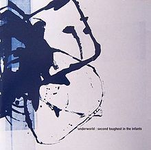
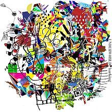
    Tomato designed the artwork for Dubnobasswithmyheadman. It features black and white type that has been "multiplied, smeared, and overlaid" so much that it is nearly unreadable, alongside a "bold symbol consisting of a fractured handprint inside a broken circle".
    According to the authors of The Greatest Album Covers of All Time, the cover "set a new standard of presentation for subsequent Dance albums". In Graphic Design: A New History, Stephen Eskilson cites the cover as a notable example of the "expressive, chaotic graphics" that developed in the 1990s, a design style he calls "grunge". Paul Zelevansky of the journal Substance says that "the packaging … replays the visual poetry of the 1960s and '70s and fast forwards to the alchemical transformations of computer graphics packages.

    další spolupráce Underworld a tomato:

    PhotobucketPhotobucketPhotobucketPhotobucketPhotobucket
    SCHWITA
    SCHWITA --- ---
    Photobucket

    Interpol - Our Love to Admire (2007)

    At first glance the cover looks like an image from National Geographic or a still from an Animal Planet documentary. On closer inspection you see that the animals are in-fact taxidermy. The cover and inside imagery are the work of New York photographer Seth Smoot. Most of the images are staged in a dry or cold landscape and depict harsh scenes from the animal world.

    Somehow the artwork seems to make sense when listening to the album. Interpol’s traditional black, white and red colour scheme is gone (which could reflect the bands move to a major record label) but a bleak atmosphere is still prevalent.

    There is also some beautiful typography provided by David Calderley.
    SCHWITA
    SCHWITA --- ---
    Photobucket

    Massive Attack - Mezzanine (1998)

    The sleeve for Massive Attack’s 1998 album, Mezzanine, was conceived and executed by band member Robert Del Naja (also known as “3D”) along with collaborator Tom Hingston. The pair took a photograph created by fashion photog Nick Knight — who had once snapped shots of insects for the Museum of Natural History — and manipulated it into a stunning (and somewhat frightening) nightmare of an album cover. “Knight added a metallic edge to the image by combining several color copies together and photographing them.”

    Photobucket
    SCHWITA
    SCHWITA --- ---
    Photobucket

    Arcade Fire - Neon Bible (2007)

    The artwork for the album is a photograph of a six-foot neon sign that the band commissioned for use while on tour. In the photograph used for the cover, the lighted Bible is caught in mid-flicker. Rolling Stone named the artwork one of the five best of the year. AOL Music cited the cover as an example of an artist "keeping artwork alive." The artwork would go on to win Tracy Maurice and François Miron the Juno Award for best CD/DVD Artwork Design of the Year. Frontman Win Butler stated in an interview that the album title is derived from him being particularly attracted to the image, not from the John Kennedy Toole novel The Neon Bible.
    SCHWITA
    SCHWITA --- ---
    Photobucket

    Yeah Yeah Yeahs - It's Blitz! (2009)

    This striking piece of action photography heralds the third studio release from New York based post-punk act Yeah Yeah Yeahs. Lead singer Karen O’s distinctive vocals are still the band’s signature and this cover art succeeds in capturing the tensions that make her so electric. As sexy as she as she is scary, you want to get her into bed even though you know she’ll eat you’ll alive.

    Apart from the sheer beauty of the photography, this cover appears destined for iconic status because it conveys so much with so little. The aggressive fury in the fist plays in stark contrast to the sensuous colours and textures of the egg.
    SCHWITA
    SCHWITA --- ---
    Photobucket

    Minor Threat - Minor Threat (1981)

    Minor Threat are credited with being one of the first hardcore punk rock groups to come out of the USA. It is true that amongst the punk-underground-alternative-independent-etc scene this album cover, a photo of Alec MacKaye (Ian’s brother) asleep after a gig taken by Susie Josephson Horgan, has taken on an almost iconic status.

    The strength in the sharpness of the colour and the descending print on the right-hand-side is confronting and satisfying. The bald head, the boots, the second-hand clothes and the garbage on the cement floor leave one in little doubt that, if the scene is not desperate, it is one that reflects a subculture of some sort. The band and the label themselves recognised the power of the image by using it three times in different colors.
    SCHWITA
    SCHWITA --- ---
    Photobucket

    Roots Manuva - Slime & Reason (2008)

    “The building of the head was a long process, and one that we weren’t quite sure how to approach. We thought originally that we would commission a sculptor to make the bust, but that was extremely expensive and the result may not have looked exactly like Roots, then we thought about a live cast of the head in plaster, but they can often look quite ‘dead’, the face can sag in the plaster and there isn’t much flexibility with the expression.

    So after some looking around we found out about 3D scanning and rapid prototyping. This was the best option, the scanning process is very quick and accurate, and having the 3D model in the computer meant we could edit the bowl into the head at that stage, before the rapid prototyping. The green slime was 3x bottles of green Aloe Vera hand soap.” (Design Studio: Oscar & Ewan)
    SCHWITA
    SCHWITA --- ---
    Photobucket

    Supertramp - Breakfast in America (1979)

    The album's front cover resembles an overlook of New York City through an aeroplane window. It was designed by Mike Doud and depicted Kate Murtagh, dressed as a waitress named "Libby" from a diner, as a Statue of Liberty figure holding up a glass of orange juice on a small plate in one hand (in place of the torch on the Statue), and a foldable restaurant menu in the other hand, on which "Breakfast In America" is written. The background featured a city made from a cornflake box, ashtray, cutlery (for the wharfs), eggboxes, vinegar, ketchup and mustard bottles, all spraypainted white. The twin World Trade Center towers appear as two stacks of boxes and the plate of breakfast represents Battery Park, the departure point for the Staten Island Ferry.
    SCHWITA
    SCHWITA --- ---
    Photobucket

    Blur - Modern Life Is Rubbish (1993)

    The album's title derives from stenciled graffiti painted along Bayswater Road in London, created by an anarchist group. For Albarn, the phrase reflected the "rubbish" of the past that accumulated over time, stifling creativity. Albarn told journalist John Harris in 1993 that he thought the phrase was "the most significant comment on popular culture since 'Anarchy in the UK'". Due to Blur's disdain for America at the time, the album's working title was "Britain versus America".

    The painting of the steam train on the album cover was a stock image that Stylorouge—Blur's design consultants—obtained from a photo library in Halifax. Inside the packaging, there is an oil-on-canvas of the band dressed as mop-top skinheads in a tube train. The album's lyric sheets also feature the songs' chord progressions, hand-written by guitar player Graham Coxon.
    SCHWITA
    SCHWITA --- ---
    Photobucket

    Burial - Burial (2006)

    Burial’s tunes are ghostly, foggy, late night South London dance music. The beats are hazy and buried underneath layers of rain and pirate radio crackle, the melodies mournful yet hopeful, and vocal fragments echo into the distance. This is music for listening to at night, on a night bus or late walk home on the street.
    The shot of foggy, late night South London not only evokes that feeling you’ll get when hearing the music, but the far-away distance of the shot itself hints at the distant melodies and vocal fragments contained within. Even the text has a foggy glow, like a street light glowing in the rainy night.
    LOPIK
    LOPIK --- ---
    New Order - Blue Monday 12''


    The artwork is designed to resemble a floppy disk. The sleeve does not display either the group name nor song title in plain English anywhere; the only text on the sleeve is “FAC SEVENTY THREE” on the spine. Instead the legend “FAC 73 BLUE MONDAY AND THE BEACH NEW ORDER” is represented in code by a series of coloured blocks. The key enabling this to be deciphered was printed on the back sleeve of the album, Power, Corruption & Lies. “Blue Monday” and Power, Corruption & Lies are two of four Factory releases from this time period to employ the colour code, the others being "Confusion" by New Order and From the Hip by Section 25.
    The single’s original sleeve, created by Factory designer Peter Saville and Brett Wickens, was die-cut with a silver inner sleeve. It cost so much to produce that Factory Records actually lost money on each copy sold. Matthew Robertson’s Factory Records: The Complete Graphic Album notes that “[d]ue to the use of die-cutting and specified colours, the production cost of this sleeve was so high that the single sold at a loss.” Tony Wilson noted that it lost 5p per sleeve “due to our strange accounting system”; Saville noted that nobody expected “Blue Monday" to be a commercially successful record at all, so nobody expected the cost to be an issue. In fact, in Shadowplayers: The Rise and Fall of Factory Records, Saville states “I am so bored with this story. We didn’t even know how many of these expensive covers were ever made anyway.”
    Robertson also noted that “[l]ater reissues had subtle changes to limit the cost” (the diecut areas being replaced with printed silver ink)


    Deska je možná nejvíc prodávanej maxisingl vůbec - o to víc je zajímavý, že jí prodávali za míň než vyrobili..
    SCHWITA
    SCHWITA --- ---
    vkládejte, prosím, přebaly desek ve vhodné velikosti pro všechny typy monitorů. chodí mi do pošty zbytečné připomínky. tapety a plakáty NE!
    věřím, že komukoliv se ten či onen přebal zalíbí, stáhne si ho v rozlišení a velikosti dle svého gusta.
    SCHWITA
    SCHWITA --- ---
    Photobucket

    The Stone Roses - The Stone Roses (1989)

    As with most Stone Roses releases, the cover displays a work by John Squire. It is a Jackson Pollock-influenced piece titled “Bye Bye Badman”, which makes reference to the May 1968 riots in Paris.

    Squire said: “Ian Brown had met this French man when he was hitching around Europe, this bloke had been in the riots, and he told Ian how lemons had been used as an antidote to tear gas. Then there was the documentary – a great shot at the start of a guy throwing stones at the police. I really liked his attitude.” This story was also the inspiration for the lyrics to the song of the same name.
    Kliknutím sem můžete změnit nastavení reklam