• úvod
  • témata
  • události
  • tržiště
  • diskuze
  • nástěnka
  • přihlásit
    registrace
    ztracené heslo?
    SCHWITAUmění hudebního obalu
    SCHWITA
    SCHWITA --- ---
    Photobucket Photobucket

    How To Destroy Angels - How To Destroy Angels (2010)

    The artwork for the release was created by Mark Weaver, under art direction by Rob Sheridan. Sheridan stated that the choice for Weaver was to make the release as visually distinct as possible from Nine Inch Nails.
    SCHWITA
    SCHWITA --- ---
    Photobucket

    The Black Keys - Brothers (2010)

    The album was designed by Michael Carney, the brother of drummer Patrick Carney. In 2011, Michael won the Grammy Award for Best Album Package. The album is littered with messages that identify everything, such as the front saying, "This is an album by The Black Keys. The name of this album is Brothers". This was to pay homage to the front cover design of Howlin' Wolf's 1969 album, The Howlin' Wolf Album, which reads, "This is Howlin' Wolf's new album..."
    SCHWITA
    SCHWITA --- ---
    PAWLEEQ: Lachman ( http://adolflachman.cz/cs/ ) je král. Když tenkrát oznámili spolupráci Lachmana a Mortena na komiksové verzi českého fiktivního antinazi hrdiny Péráka, tak jsem skákal do stropu. Škoda, že z toho sešlo.

    Pérák-a-SS-(1946).avi - YouTube
    http://www.youtube.com/watch?v=7UwsXOv5XXg


    sorry za OT.
    PAWLEEQ
    PAWLEEQ --- ---
    V roce 2009 u X Production vyšlo comebackové album Ave Agony české kapely Vanessa. Jeho obal kompletně řešil Adolf Lachman.


    Vanessa vždy tematizovala zlo a na této desce to není jinak. Znetvořená ruka v gestu "viktorky" získává zajímavé konotace zejména, když si uvědomíme, že obal byl k vidění ve veřejném prostoru přesně dvacet let po sametové revoluci.
    SCHWITA
    SCHWITA --- ---
    Photobucket

    Manic Street Preachers - Journal For Plague Lovers (2009)

    Journal for Plague Lovers was released on 18 May 2009, and features posthumous lyrics by Richey Edwards, rhythm guitarist and lyricist, who vanished on 1 February 1995, and was presumed deceased in 2008. The band used Jenny Saville’s 2005 painting Stare for the cover. Inspired by a newspaper cutting, the painting depicts an androgynous girl with a large birthmark on her face. But when presented with the image on a CD cover, Britain’s main supermarket chains saw something else entirely. Thinking that the image depicted a young buy with a bloodied face, they deemed the cover “inappropriate” and refused to carry the album unless it was shipped in a plain slipcover. Bradfield regards the decision as "utterly bizarre", and has commented: "You can have lovely shiny buttocks and guns everywhere in the supermarket on covers of magazines and CDs, but you show a piece of art and people just freak out."
    SCHWITA
    SCHWITA --- ---
    Photobucket

    Iggy Pop - Brick By Brick (1990)

    Brick by Brick is an album released in June 1990 by the American singer Iggy Pop. After attracting mixed reviews for much of his 1980s output, Pop hired longtime Stooges fan Don Was as producer, who would later produce Avenue B, and opted for a hard-rock sound. Many songs on the album incorporate a lyrical theme of the United States facing dangers of cultural decay and implosion. The cover was drawn by American cartoonist and illustrator Charles Burns.
    SCHWITA
    SCHWITA --- ---
    Photobucket

    Iron & Wine - Kiss Each Other Clean (2011)

    Iron and Wine‘s Sam Beam designed and drew the album cover — and even the font that’s featured on the side of the CD spine — for ‘Kiss Each Other Clean’ all by himself, welcoming a new era for the band with the spacey neon design.
    NALLE
    NALLE --- ---
    SCHWITA
    SCHWITA --- ---
    Photobucket

    Muse - The Resistance (2009)

    Created by a mysterious London design firm called La Boca, the cover depicts a human figure standing on an illuminated pathway with the Earth at the center.
    SCHWITA
    SCHWITA --- ---
    Photobucket

    Animal Collective - Merriweather Post Pavilion (2009)

    Animal Collective‘s 2009 album was a critically acclaimed breakthrough for the freak folkers — and featured an appropriately eye-catching cover. Based on a type of optical illusion called illusory motion that was developed by Japanese psychologist Akiyoshi Kitaoka, the design is created in such a way that staring at any part of it creates the illusion that the periphery sections are moving, despite the fact that it is obviously a static image.
    PAWLEEQ
    PAWLEEQ --- ---
    V roce 1964 vyšla ve Spojených státech deska The Beatles s názvem Meet The Beatles. Obal desky žádným nápadem nevyniká, ostatně posuďte sami: ,
    ovšem o 10 let později vydala svůj debut daleko zajímavější formace, fenomenální popová kapela ze severní Luisiany The Residents. Deska se jmenuje Meet The Residents a její obal na Beatles odkazuje. s hudbou je to "malinko složitější", ale to je na delší esej :)
    SCHWITA
    SCHWITA --- ---
    Photobucket

    Led Zeppelin - Led Zeppelin (1969)

    Led Zeppelin's front cover, which was chosen by Page, features a black-and-white image of the burning Hindenburg airship ( http://en.wikipedia.org/wiki/LZ_129_Hindenburg ). The image refers to the origin of the band's name itself: when Page, Jeff Beck and The Who's Keith Moon and John Entwistle were discussing the idea of forming a group, Moon joked, "It would probably go over like a lead balloon", and Entwistle allegedly replied, "...a lead zeppelin!"
    SCHWITA
    SCHWITA --- ---
    Estetiku a stylizaci psychobilly kapel mám docela rád (i když je to pořád to samé dokola). Nedlouho tomu jsem byl na Demented Are Go! na sedmičce a Sparky mě velice potěšil "zapíchnutou" injekcí do lebky. Která navíc vydržela celou show.

    Photobucket

    Demented Are Go - Welcome back to Insanity Hall (2012)

    Demented Are Go! are a Welsh psychobilly band that was formed around 1982 in Cardiff. They were one of the earliest in the initial wave of bands to mix punk rock with rockabilly, and as a result, are considered to be highly influential to the psychobilly scene.
    ASYD
    ASYD --- ---


    The Cramps - Songs the Lord Taught Us (1980)

    k obalu nic nemam, ale jeden pribeh aspon:
    Dear the Cramps,

    So I bought this album the other day because my girlfriend said she had cramps and she didn't want to make out. So I start thinking, why would some old band make my girlfriend not want to make out with me?

    After looking around the record store for a while I got this album and then I took it home and called her and said "Don't worry, I don't need to make out either, I've got The Cramps too." Then I turned it on and fiogured it all out.

    Your band totally makes people not want to make out. I think it even makes people sick, mostly girls. At school I always hear girls saying, "Oh, my cramps are so bad." And I'm like, "Well, why don't you just try listening to something else?"

    Yours,
    Superdude

    SCHWITA
    SCHWITA --- ---
    Photobucket

    Swans - The Seer (2012)

    Frontman Michael Gira described the album as taking "30 years to make. It's the culmination of every previous Swans album as well as any other music I've ever made, been involved in or imagined. But it's unfinished, like the songs themselves. It's one frame in a reel. The frames blur, blend and will eventually fade." The artwork from the album is by Simon Henwood, and features Gira's teeth.
    SCHWITA
    SCHWITA --- ---
    Photobucket

    Biffy Clyro - Only Revolutions (2009)

    The album is named after the novel Only Revolutions by Mark Z. Danielewski. Bassist James Johnston notes: "The nice thing is that it's a story told from two points of view and Simon got married last year and I think it's a love record in that regard, it's about his relationship with his new wife. A lot of it is about trying to take arguments from somebody else point of view and be able to see two sides of the picture."
    SCHWITA
    SCHWITA --- ---
    Photobucket

    Miles Davis - Bitches Brew (1970)

    Mati Klarwein, the painter of the artwork, was a European Jewish refugee from Nazism, who studied with Dali. He also painted the sleeve for Santana's Abraxas, the rock equivalent of Bitches Brew.

    What does the picture mean? Miles is stating that the roots of jazz, of blues, of rock and of civilisation began in Africa. It is also a unification between black and white, between rock and jazz. The thunder in the distance suggests the turbulence of the grooves within: this was the way forward – the jazz-rock fusion thunder. Ultimately, the sleeve matches the (new) Directions in Music by Miles Davis, in that the figures on the painting are embracing, staring into a technicoloured new future for jazz. It is saying that jazz can go into rock, and will do amazingly.
    SCHWITA
    SCHWITA --- ---
    Photobucket

    Radiohead - Hail To The Thief (2003)

    Hail to the Thief's artwork was created by Stanley Donwood, who has produced the artwork for every Radiohead album since The Bends. The cover art, titled "Pacific Coast", is a road map of Hollywood, with words and phrases taken from Los Angeles' roadside advertising, such as "God", "TV" and "oil", in place of buildings. Donwood said: "Advertising is designed to be seductive and attractive and, in a lot of ways, it's very beautiful. But there's something unsettling about being continually sold something. I liked taking the elements of roadside advertising out of context because it removes the imperative and just goes to the essence of it – the pure heart of advertising."
    Other words in the artwork were provided by Yorke, who made lists of words "that rang bells in my head" from the political discussion surrounding the September 11 attacks and subsequent War on Terror; many of the words also appear in the album's lyrics. Comparing it to the more subdued colours of his earlier Radiohead covers, Donwood described the cover's bright, "pleasing" colours as "ominous because all these colours that I've used are derived from the petrol-chemical industry (...) None of it is natural. It essentially comes from black sludge.
    SCHWITA
    SCHWITA --- ---
    Photobucket Photobucket

    New Order - Power, Corruption & Lies (1983)

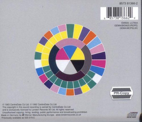
    Peter Saville's design for the album had a colour-based code to represent the band's name and the title of the album, but they were not actually written on the sleeve itself.

    Photobucket

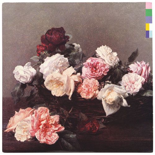
    The cover is a reproduction of the painting "A Basket of Roses" by French artist Henri Fantin-Latour, which is part of the National Gallery's permanent collection in London. At the gallery Saville picked up a postcard with Fantin-Latour's painting, and his girlfriend mockingly asked him if he was going to use it for the cover. Saville suggested that the flowers "suggested the means by which power, corruption and lies infiltrate our lives. They're seductive." The cover was also intended to create a collision between the overly romantic and classic image which made a stark contrast to the typography based on the modular, colour-coded alphabet he created solely for the band.
    It is also said that the owner of the painting (The National Heritage Trust) first refused Factory Records access to it. Tony Wilson, the head of the label, then called up the gallery director to ask who actually owned the painting and was given the answer that the Trust belonged to the people of Britain, at some point. Wilson then famously replied, "I believe the people want it." The director then replied, "If you put it like that, Mr Wilson, I'm sure we can make an exception in this case."
    SCHWITA
    SCHWITA --- ---
    PhotobucketPhotobucket

    The Mars Volta - De-Loused in the Comatorium (2003)

    De-Loused became, both critically and commercially, the band's biggest hit, eventually selling in excess of 500,000 copies despite limited promotion, and was featured on several critics' "Best of the Year" lists. The cover artwork is by Storm Thorgerson.
    Kliknutím sem můžete změnit nastavení reklam