
 Peter Gabriel - 1, 2, 3
Peter Gabriel produced three funky, angular albums between 1977 and 1980 sharing the same bare typography, the same eponymous title and similar, striking portraiture.
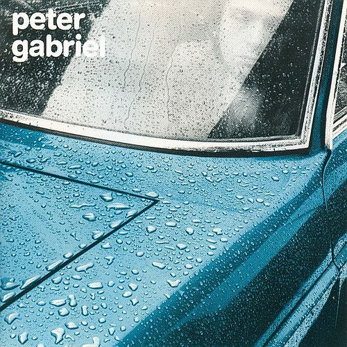
1 (Car) (1977) - Another Hipgnosis creation, the spot colour on Peter Gabriel 1 was achieved by layered exposure of monochrome and colour negatives. Photoshopping before Photoshop, in other words.
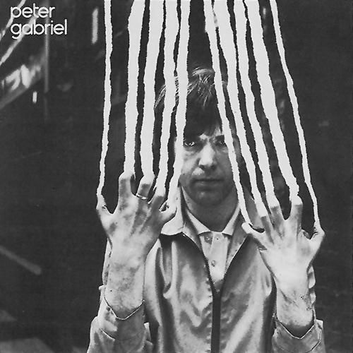
2 (Scratch) (1978) - In “Scratch”: Gabriel’s outstretched fingers tear away the cover. This is a 35mm black and white still, with torn strips of paper glued on top. It was then re-photographed; the new shot was meticulously tippexed to disguise the rougher joins. It was then photographed yet again to produce the end result. Today, a similar effect would involve a basic design program and a lot of messing around, but it could never achieve the same result.
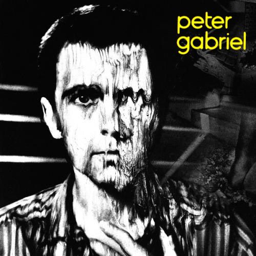
3 (Melt) (1980) - The photo was taken with a Polaroid SX-70 instant camera. The sleeve's designer Storm Thorgerson said: "Peter himself joined with us at Hipgnosis in disfiguring himself by manipulating Polaroids as they 'developed'… Peter impressed us greatly with his ability to appear in an unflattering way, preferring the theatrical or artistic to the cosmetic."