• úvod
  • témata
  • události
  • tržiště
  • diskuze
  • nástěnka
  • přihlásit
    registrace
    ztracené heslo?
    SCHWITAUmění hudebního obalu
    SCHWITA
    SCHWITA --- ---
    Photobucket

    Boards Of Canada - Music Has Right To Children (1998)

    Fully integrated into the creative process, the cover design of almost all Boards of Canada releases is executed by the band’s members, Mike Sandison and Marcus Eon. The understated typography and fuzzy, saturated illustration of Music Has the Right to Children is a welcome sign to the listener, hinting at what’s inside.

    Recorded at their own Hexagon Sun Studio in Scotland, the widely acclaimed record features a cover that harkens back to Polaroid pictures of the 1970s: it’s a romanticized paean to the travelogue, the casual grouping of parents and children and brothers and sisters, likely near some national monument or oceanscape. Rendered with the look of a cracked and aged bit of memorabilia, the intrigue is stretched further as the faces of the subjects fade into the mist itself.
    GET10
    GET10 --- ---


    Machinedrum - Nastyfuckk EP (2012)

    TAJAK
    TAJAK --- ---


    Laurent Garnier ‎– Unreasonable Behaviour (2000)

    TAJAK
    TAJAK --- ---


    Aphex Twin ‎– ...I Care Because You Do (1995)

    SCHWITA
    SCHWITA --- ---
    Photobucket

    My Bloody Valentine - Loveless (1991)

    The cover art is nearly as iconic as the album itself. Like the music within, it’s a swirling, vibrating, super-charged jolt of guitar wailing.
    Billy Corgan of The Smashing Pumpkins told Spin, "It's rare in guitar-based music that somebody does something new [...] At the time, everybody was like, 'How the fuck are they doing this?' And, of course, it's way simpler than anybody would imagine." Corgan later recruited Alan Moulder to co-produce the Pumpkins' album Mellon Collie and the Infinite Sadness (1995). Trent Reznor of Nine Inch Nails, who praised the album's musical diversity and production, also worked with Moulder on the third Nine Inch Nails studio album, The Fragile.
    WENOUSH
    WENOUSH --- ---
    Roly Porter - Afterime (2011)
    SCHWITA
    SCHWITA --- ---
    Photobucket

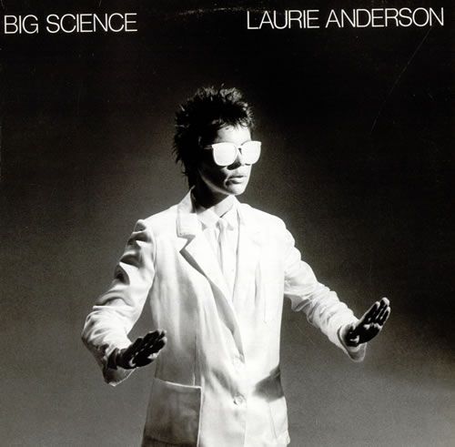
    Laurie Anderson - Big Science (1981)

    With a nod to David Bowie‘s Heroes, Laurie Anderson‘s compelling cover to Big Science was the result of some typical rock and roll chemistry (and a whole lot of visual manipulation).

    “Considering the mind numbing deadline pressure, fatigue, caffeine, nicotine and adrenaline on which I was operating, I feel fortunate to have had the presence of mind to put film in the camera.”
    So said photographer Greg Shifrin about the photo he took for the cover of Laurie Anderson’s 1981 release on Warner Bros., Big Science.

    The photo was shot on a Princeton, NJ sound stage during the video session for Anderson’s surprise hit, “O Superman.” The photos didn’t come out exactly as Anderson had hoped, so a complete reshoot with another photog was arranged. But, when a second try failed to deliver the needed results, a heavily retouched version of Shifrin’s work was ultimately used.

    “At one point, we were obsessed with the shadow on Laurie’s left hand,” said art director Perry Hoberman in 100 Best Album Covers. “We burned through several airbrushes trying to get it exactly right.”

    The result: an oddly-captivating image of Anderson bending light and dark into otherwise impossible configurations, not unlike her music.
    SCHWITA
    SCHWITA --- ---
    Photobucket

    Captain Beefheart & His Magic Band - Trout Mask Replica (1969)

    So said Cal Schenkel, the designer at Frank Zappa‘s Straight and Bizarre imprints, who was tasked with coming up with the cover of Captain Beefheart and His Magic Band‘s 1970 set, Trout Mask Replica.
    “We went to the farmer’s market and got this actual fish, a real fish,” he’s quoted as saying. “We rigged it up for a prop, and it was just an amazing session.”

    Captain Beefheart himself (a.k.a. Don Van Vliet) wore the fish on his face, made better only by the green velvet smoking jacket and blue neo-’70′s cravat.

    Filmmaker David Lynch has called Trout Mask Replica his favorite album of all time, and John Lydon has also listed the album as one of his favourites, noting, "The first time I played that album, I laughed all the way through."
    SCHWITA
    SCHWITA --- ---
    Photobucket

    Radiohead - OK Computer (1997)

    The album's artwork is a collage of images and text created by Stanley Donwood and Yorke, credited under the pseudonym "The White Chocolate Farm". Donwood was commissioned by Yorke to work on a visual diary alongside the recording sessions. Yorke explained, "If I'm shown some kind of visual representation of the music, only then do I feel confident. Up until that point, I'm a bit of a whirlwind." The colour palette is predominantly white and blue, according to Donwood, the result of "trying to make something the color of bleached bone." Used twice on the artwork, once in the booklet and once on the compact disc itself, is the image of two stick figures shaking hands. Yorke explained the image as emblematic of exploitation, saying, "Someone's being sold something they don't really want, and someone's being friendly because they're trying to sell something. That's what it means to me." Explaining the artwork's themes, Yorke said, "It's quite sad, and quite funny as well. All the artwork and so on ... It was all the things that I hadn't said in the songs."
    SCHWITA
    SCHWITA --- ---
    Photobucket

    Primal Scream - Screamadelica (1991)

    The album cover for Screamadelica was painted by Creation Records' in-house artist Paul Cannell, who died in 2005. Screamadelica was among ten album covers chosen by the Royal Mail for a set of "Classic Album Cover" postage stamps issued in January 2010.
    TAJAK
    TAJAK --- ---


    WWW - Neurobeat (2006)
    SPYYDY
    SPYYDY --- ---

    The Residents - Eskimo (1979)

    THE RESIDENTS Eskimo (1979 US 6-track vinyl LP inspired by the sounds recorded and photographs taken by the Residents friend, the mysterious N. Senada while he was in the North Pole, gatefold picture sleeve & original inner. The sleeve shows minor signs of general shelfwear, but the vinyl is flawless! ESK7906).
    SCHWITA
    SCHWITA --- ---
    Photobucket

    The Prodigy . Music For The Jilted Generation (1994)

    The album is largely a response to the corruption of the rave scene in Britain by its mainstream status as well as Great Britain's Criminal Justice and Public Order Act 1994, which criminalised raves and parts of rave culture. The cover of the inner artwork of the record was analyzed in an article published in 2008 in the techno underground Magazine Datacide. The author compares the picture with a persiflage which was published in 2003 on the Kid606 album Kill Sound Before Sound Kills You. The article not only describes the representation of raves in graphic artwork but also describes the marketing strategy of the band with the album and criticizes it:

    "With the picture The Prodigy are taking a stance in the conflict of ravers versus the police in those days. At the same time this statement is used to market a rebellious attitude. The picture is part of the artwork of a record - which is of course a commodity. The teenage (and male) consumer ought to identify himself with the presented rebellion. With the help of the artwork a certain image of The Prodigy is established: They should be seen as anti-stars, who define themselves through refusal and opposition [...]."
    SCHWITA
    SCHWITA --- ---
    Photobucket

    The Misfits - Horror Business (1979)

    The single's cover features a skeletal figure inspired by a poster for the 1946 film serial The Crimson Ghost. The figure became a mascot for the band, and its skull image would serve as the Misfits' logo for the rest of their career.
    SCHWITA
    SCHWITA --- ---
    Photobucket

    The Who - Who's Next (1971)

    Cover artwork shows a photograph, taken at Easington Colliery, of the band apparently having just urinated on a large concrete piling protruding from a slag heap. According to photographer Ethan Russell, most of the members were unable to urinate, so rainwater was tipped from an empty film canister to achieve the desired effect. The striking, partially cloudy sky seen above the site was also composited from a separate image. The photograph is often seen to be a reference to the monolith discovered on the moon in the film 2001: A Space Odyssey, which had been released only about three years earlier.
    SCHWITA
    SCHWITA --- ---
    Photobucket

    The Smiths - The Smiths (1984)

    The sleeve cover for The Smiths was designed by Morrissey. It features American actor Joe Dallesandro in a cropped still from Andy Warhol's 1968 film Flesh. The photograph of Morrissey on the original card inner sleeve was taken at an early London concert by Romi Mori who would subsequently play bass guitar for the Gun Club.
    MADAM_BERNAU
    MADAM_BERNAU --- ---


    FORMA / EAROTIKON (CZ) 2011
    FORMA
    http://forma.bandcamp.com/

    Cover design by Ondřej Zita
    SCHWITA
    SCHWITA --- ---
    Photobucket

    Patti Smith - Horses (1975)

    The cover photo was taken by Robert Mapplethorpe using natural light in a penthouse in Greenwich Village. The triangle of light on the wall (too blurry to discern as a geometric figure on the above low resolution image) was the product of the afternoon sun. The record company wanted to make various changes to the photo, but Smith overruled such attempts.
    Feminist professor Camille Paglia described the album's cover as "one of the greatest pictures ever taken of a woman." N.B.: The jacket Smith has trapped around her shoulder actually has a horse pin.
    MATHEW
    MATHEW --- ---
    asi nejpovedenější obal co jsem letos viděl (a zároveň jedna z nejlepších desek)

    Laurel Halo - Quarantine (Hyperdub 2012)

    SCHWITA
    SCHWITA --- ---
    Photobucket

    Small Faces - Ogdens' Nut Gone Flake (1968)

    The album was originally released on vinyl in a circular novelty package of a metal replica of a giant tobacco tin inside which was a poster created with 5 connected paper circles with pictures of the band members. This proved too expensive and was quickly followed by a paper/card replica with a gatefold cover. Two limited-edition CD releases (including a three-disc deluxe edition in 2006 that included the original mono mix of the album on CD for the first time) went even further by packaging the disc(s) in a circular tin (as the original vinyl release had). However, most CD releases use conventional packaging, superimposing the circular artwork on a square booklet.
    The award-winning artwork for the album cover was done by Mick Swan who was a product of the sixties art school scene. Any other work by him is unknown but he is known to have worked as a fine arts tutor at Lowestoft F.E. College in 1974.
    Kliknutím sem můžete změnit nastavení reklam